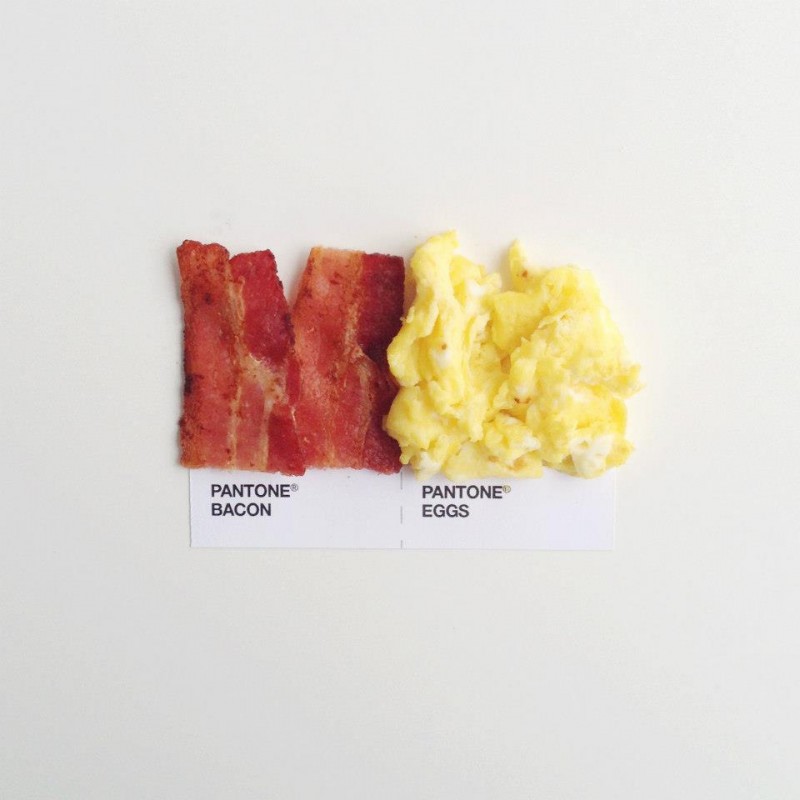
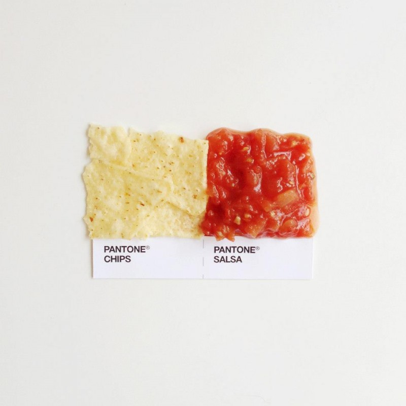
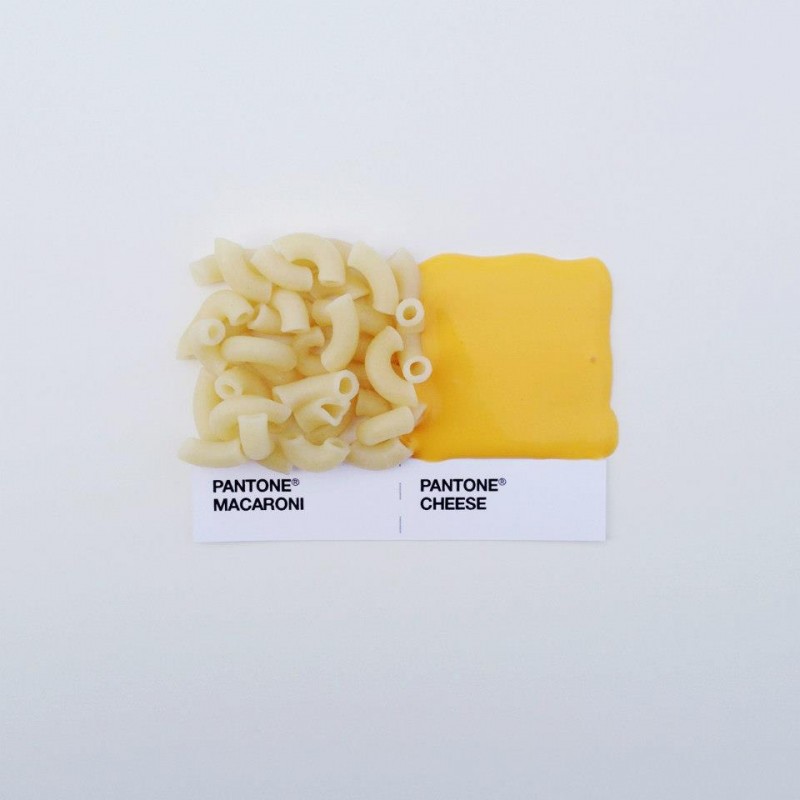
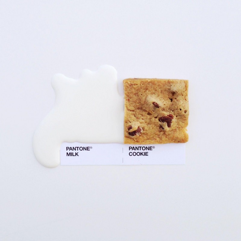
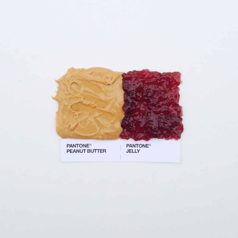
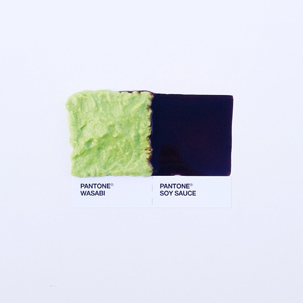
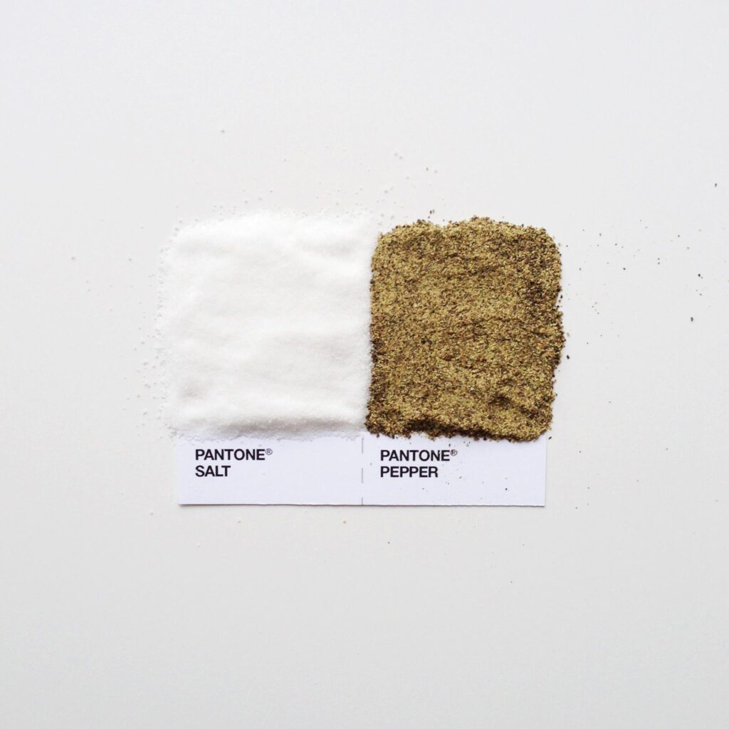
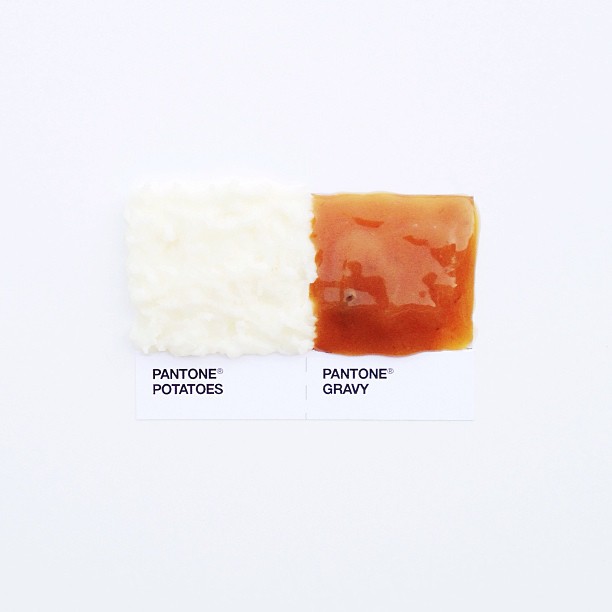
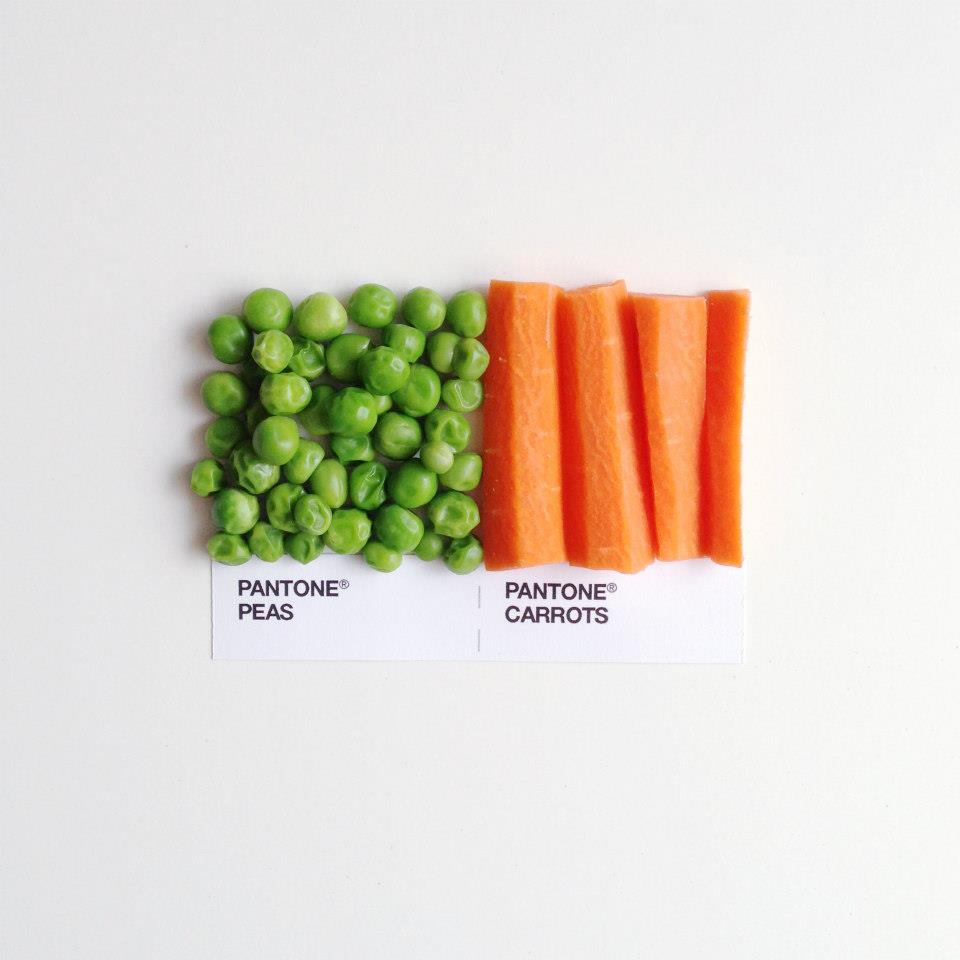
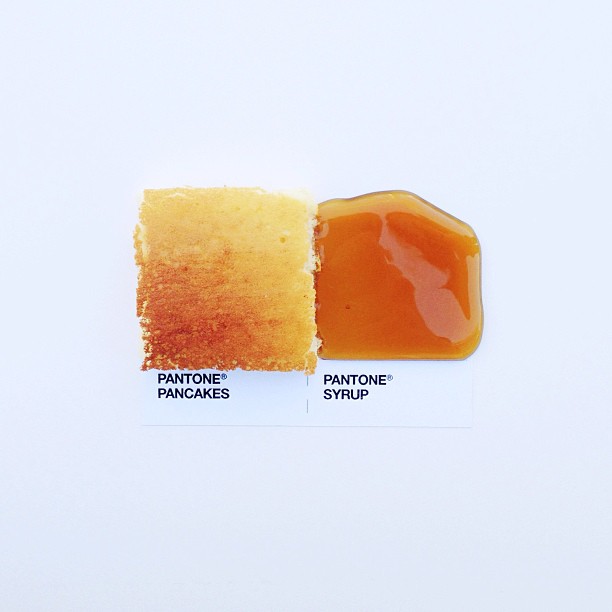
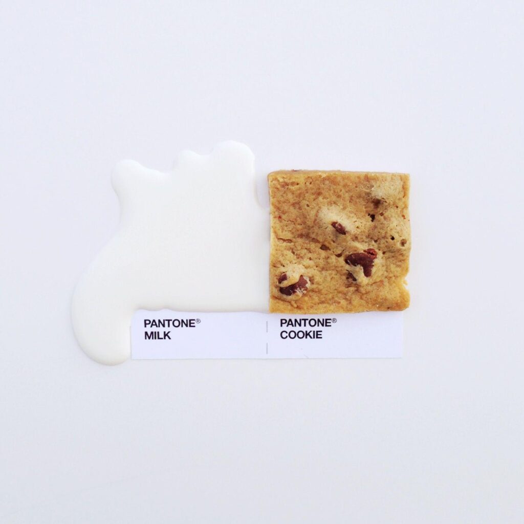
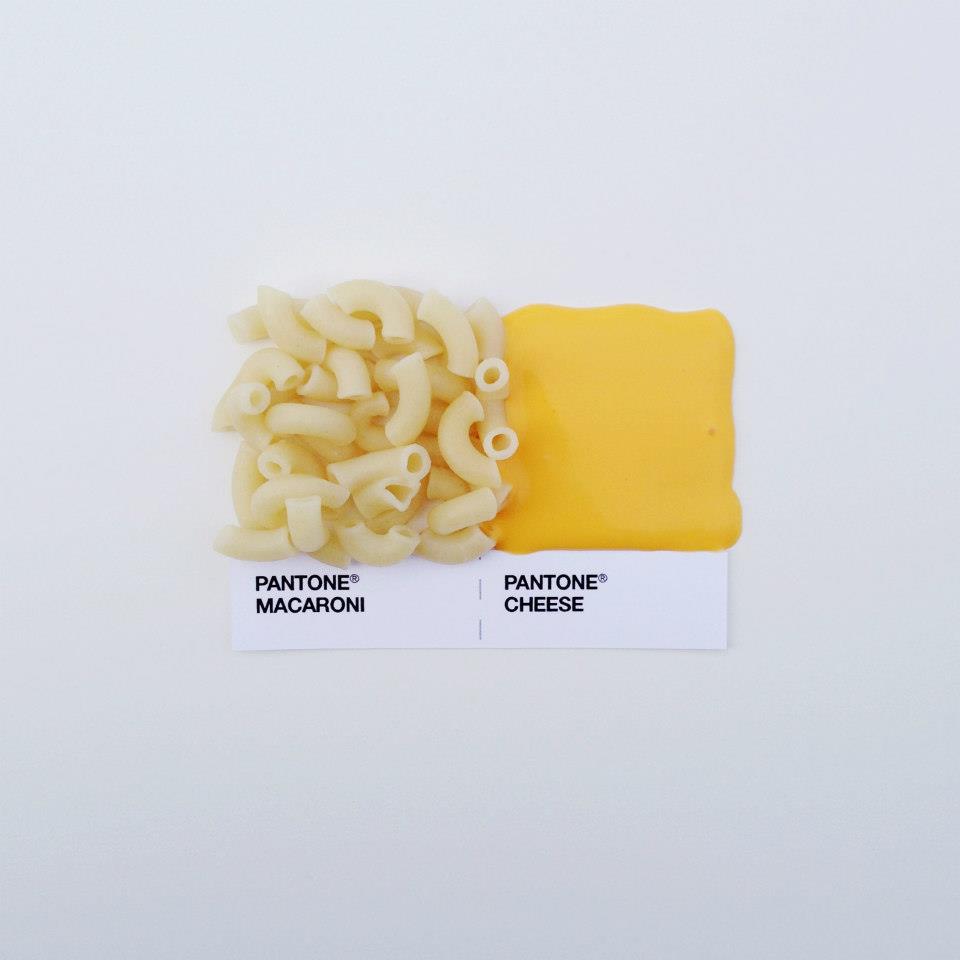
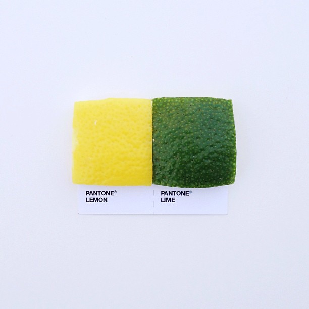
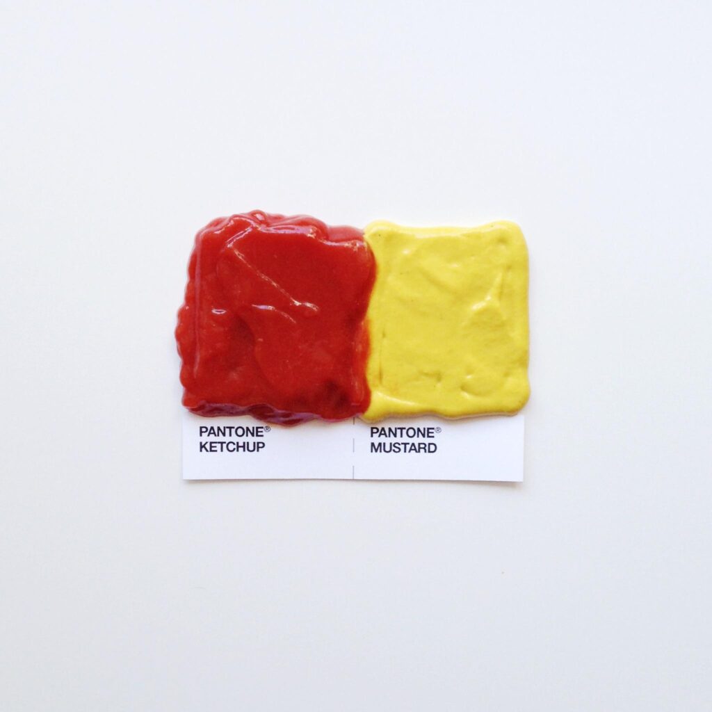
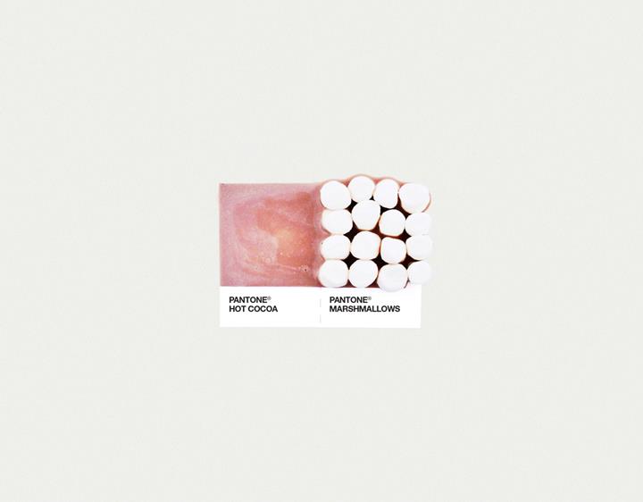
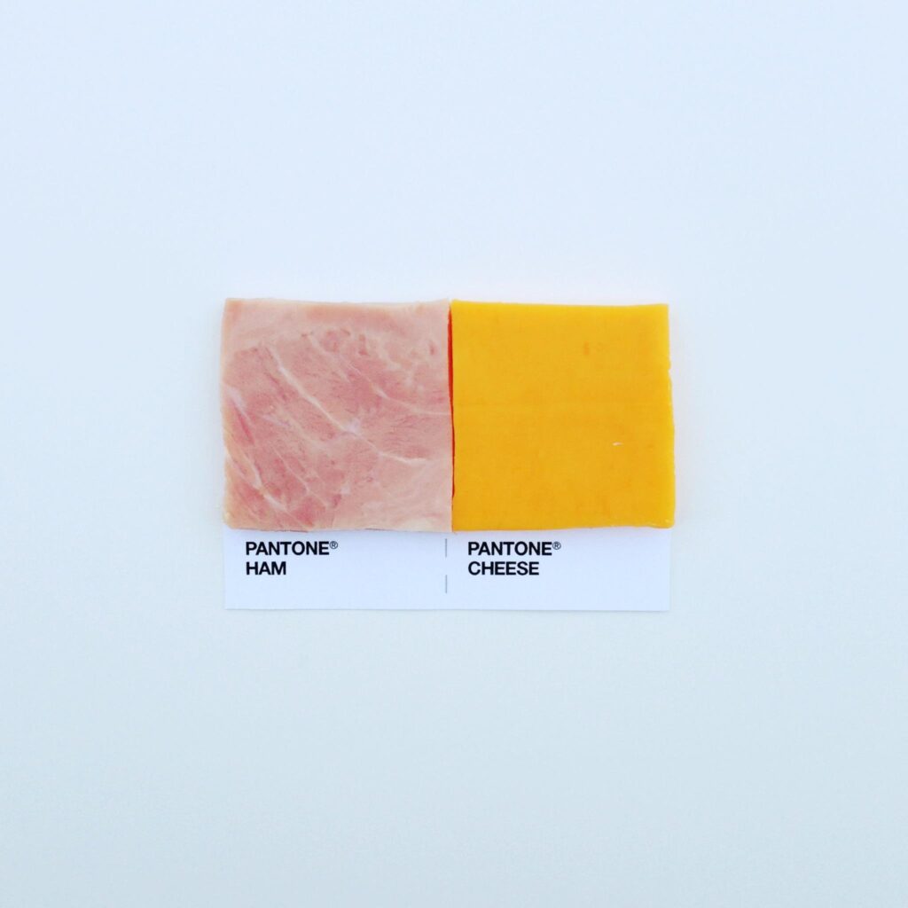
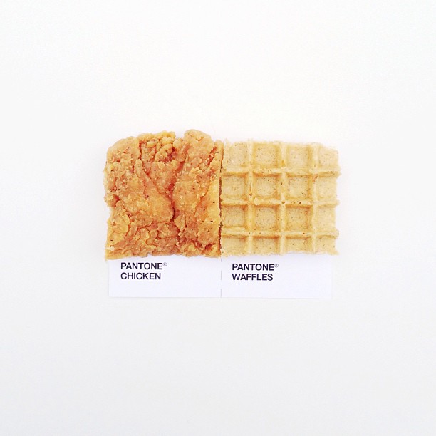
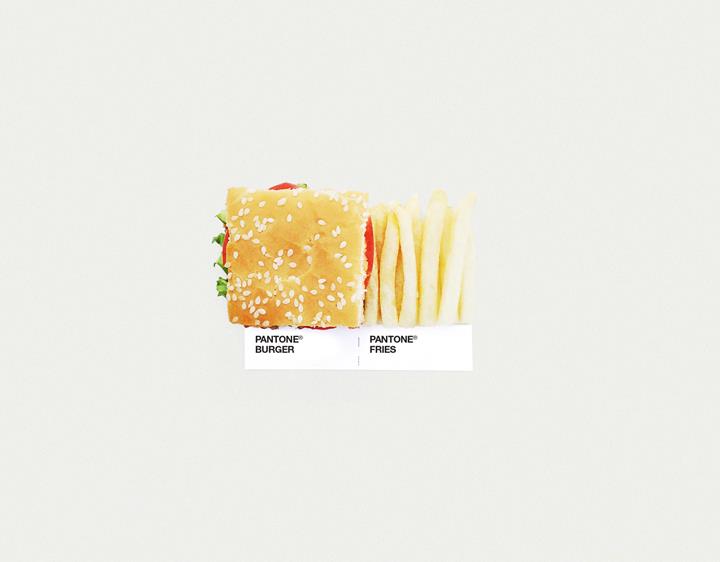
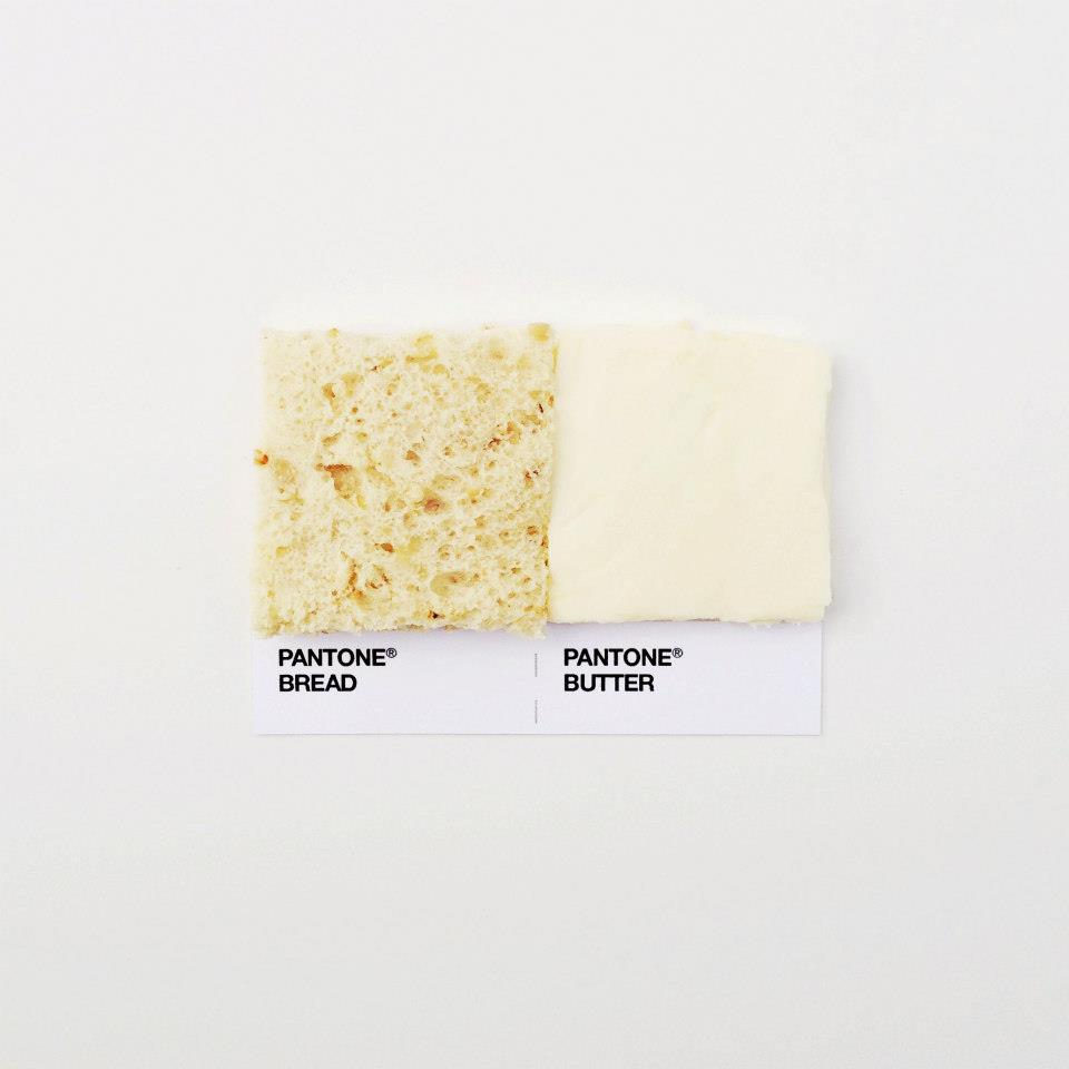
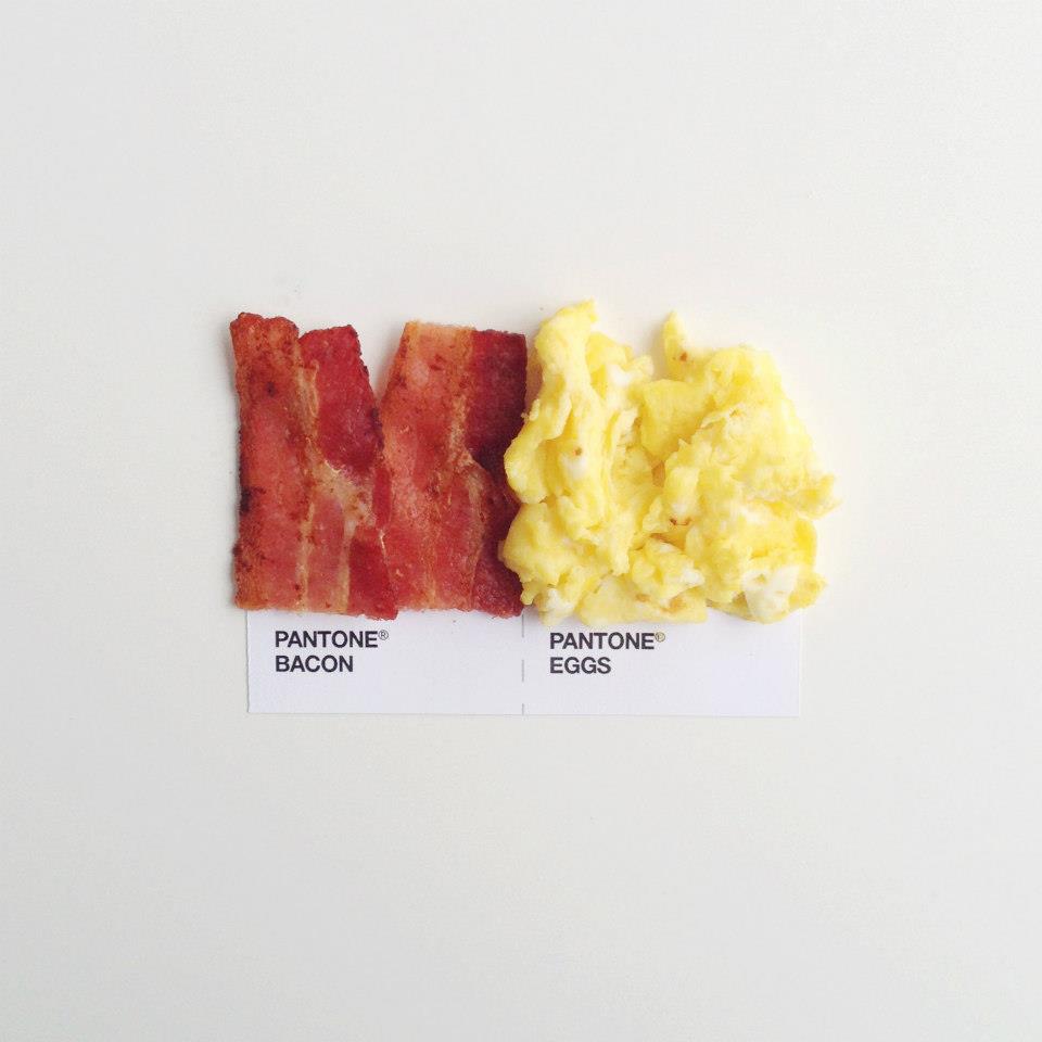
As a designer, you’re constantly picking color chips and pairing them up with one another. A while back I had an idea of making Pantone chips out of real household objects—sponges, cardboard, and the like. But while I was finishing up a poster design, I had taped two Pantone chips together to see how they looked next to one another. Instantly I thought of how people pair food together, and that was that. Pantone pairings. via
David Schwen is a creative based in Minneapolis, Minnesota who specializes in illustration, design and art direction. He has worked with such brands as Apple, Fast Company, GOOD, GQ, Nestle, Wired and more. Schwen has created and cooked up the popular series Pantone Pairings on his Instagram feed (This came up on our radar 2 weeks ago, before the big blogs started jumping on this viral series. We’re kicking ourselves for not featuring it sooner).
There’s something about those Pantone swatches that people just love. It’s the black Helvetica (?) typeface in white space, the tidy, square swatch of color, combining for minimalist, efficient design. Couple that infectious, iconic design with clever photography AND the public’s obsession with foodie pics and you have yourself a masterpiece mashup. (rises to feet, slow claps)
Pantone Pairings is one of those things you wish you came up with…
